How To Add Dark Mode To Your Gridsome Blog With Tailwind CSS
 Photo by Austin Neill on Unsplash
This is part eleven of a series on building a file-based blog from scratch with Gridsome. Find the full series here.
UI is finally moving to dark mode. More and more websites allow users to select a dark theme. MacOS, iOS, many apps, and even Windows 10 have dark mode.
At the end of this article, you will know how to add dark mode to your Gridsome website with Tailwind CSS.
The end result will look like this:
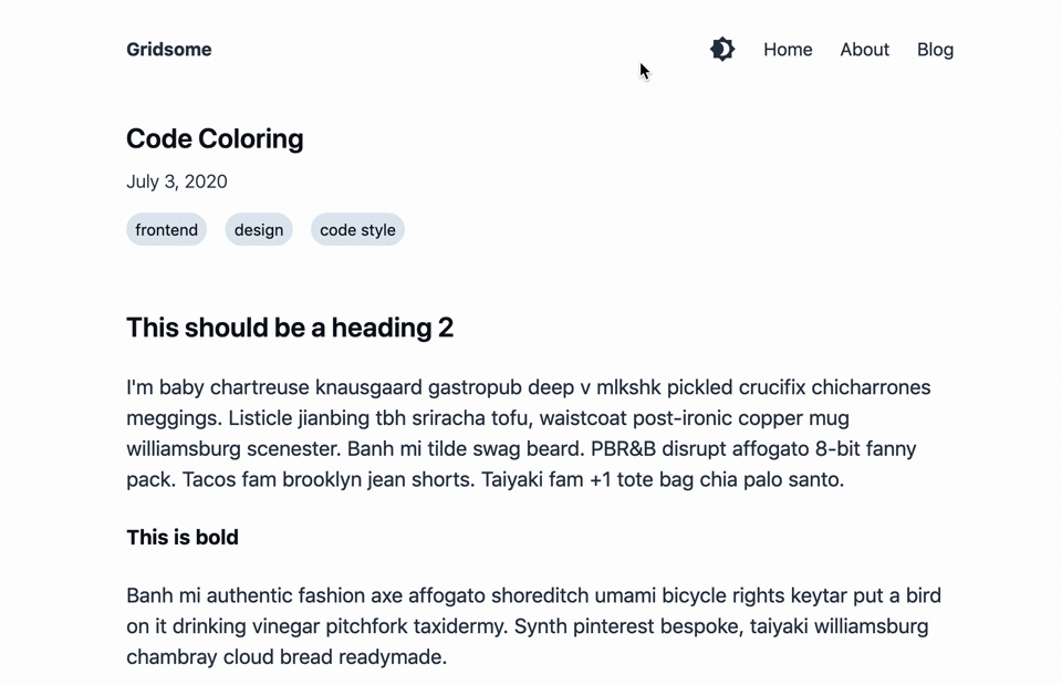
Let's find out how to build this!
How to create themes with Tailwind CSS
We configure our Tailwind CSS with the tailwind.config.js.
The usual Tailwind config allows you to override and add color to your palette, select the font, and generally add, change, and remove available utility classes.
Until now, out tailwind.config.js looks like this:
module.exports = {
  purge: {
    enabled: false
  },
  theme: {
    extend: {}
  },
  variants: {},
  plugins: []
}
We override the colors for text and background, while leaving the other colors available. Later on, when we add colors to our website, we may also need to make the other colors dependent on the theme. But for now, adjusting text and background colors is enough to get our dark theme started.
We will use native CSS variables (“CSS Custom Properties”) to enable CSS-native theming:
module.exports = {
  purge: {
    enabled: false
  },
  theme: {
    extend: {},
    textColor: {
      default: 'var(--color-text-default)',
      soft: 'var(--color-text-soft)',
      strong: 'var(--color-text-strong)'
    },
    backgroundColor: {
      default: 'var(--color-bg-default)',
      soft: 'var(--color-bg-soft)',
      softer: 'var(--color-bg-softer)',
      strong: 'var(--color-bg-strong)',
      'inline-code': 'var(--color-bg-inline-code)'
    }
  },
  variants: {},
  plugins: []
}
These are the colors we need to theme for now. I oriented the colors round their use:
defaultis the color we want to use for regular text on a regular backgroundsoftis a softer version of the default color: for light colors it is darker, and for dark colors the soft version is lighterstronggoes the opposite direction of soft: for light colors it is an even brighter version, and for dark colors the strong version is even darkerinline-codeis a background color for our inline-code
Now we need to add the necessary CSS variables to our main.css:
:root {
  --color-bg-default: #FFFFFF;
  --color-bg-soft: #EDF2F7;
  --color-bg-softer: #E2E8F0;
  --color-bg-inline-code: #EDF2F7;

  --color-text-soft: #A0AEC0;
  --color-text-default: #2d3748;
  --color-text-strong: #0E111A;
}

.theme-dark {
  --color-bg-default: #1A202C;
  --color-bg-soft: #4A5568;
  --color-bg-softer: #718096;
  --color-bg-inline-code: #4A5568;

  --color-text-soft: #CBD5E0;
  --color-text-default: #E2E8F0;
  --color-text-strong: #ffffff;
}

@tailwind base;

@tailwind components;

@tailwind utilities;
We add the default (light theme) variables to the :root selector, and override them in a theme-dark class.
I picked the colors from tailwind's default gray color palette.
When we now start our dev server with yarn develop, we get some build errors because we apply classes in our markdown.css that no longer exist.
Let's fix these before we move on.
We need to do the following within the .markdown class in the src/css/markdown.css file:
- Remove
text-gray-800from the topmost@apply. We can do that because we will apply text color globally. - Replace all occurrences of
text-blackwithtext-strong - For
codeblocks, we can remove the background color from multi-line code blocks, and need to keep it for inline code:
  & code {
    @apply font-mono text-sm inline px-1;
  }
  /* only set bg on inline code */
  & :not(pre) code {
    @apply bg-inline-code;
  }
  & pre code {
    @apply block p-4 rounded;
  }
The build is now working, but the site still looks broken. We are using text and background color classes that are no longer available. Let’s use the new theme-classes.
Integrate the theme into your Gridsome Site
First, let's use text-2xl text-strong in all of our h1 tags for consistency.
We also need to change the styling of the tags in our BlogPost.vue template:
      <g-link
        v-for="tag in $page.post.tags"
        :key="tag.id"
        :to="tag.path"
        class="bg-softer rounded-full px-2 py-1 mr-4 mb-4 text-strong hover:text-default hover:bg-soft"
      >
        {{ tag.title }}
      </g-link>
Now, we need to change our default.vue layout:
<template>
  <div class="min-h-screen bg-default text-default transition-colors delay-100 ease-linear">
    <div class="container max-w-screen-md mx-auto px-5">
      <header class="flex justify-between items-center mt-8 mb-12">
        <strong>
          <g-link to="/">{{ $static.metadata.siteName }}</g-link>
        </strong>
        <nav>
          <g-link
            to="/"
          >
            Home
          </g-link>
          <g-link
            class="ml-6"
            to="/about/"
          >
            About
          </g-link>
          <g-link
            class="ml-6"
            to="/blog/"
          >
            Blog
          </g-link>
        </nav>
      </header>
      <slot />
    </div>
  </div>
</template>
So what happened?
We have added a wrapper around our site at the highest level. This wrapper ensures that our background color always spans the whole site.
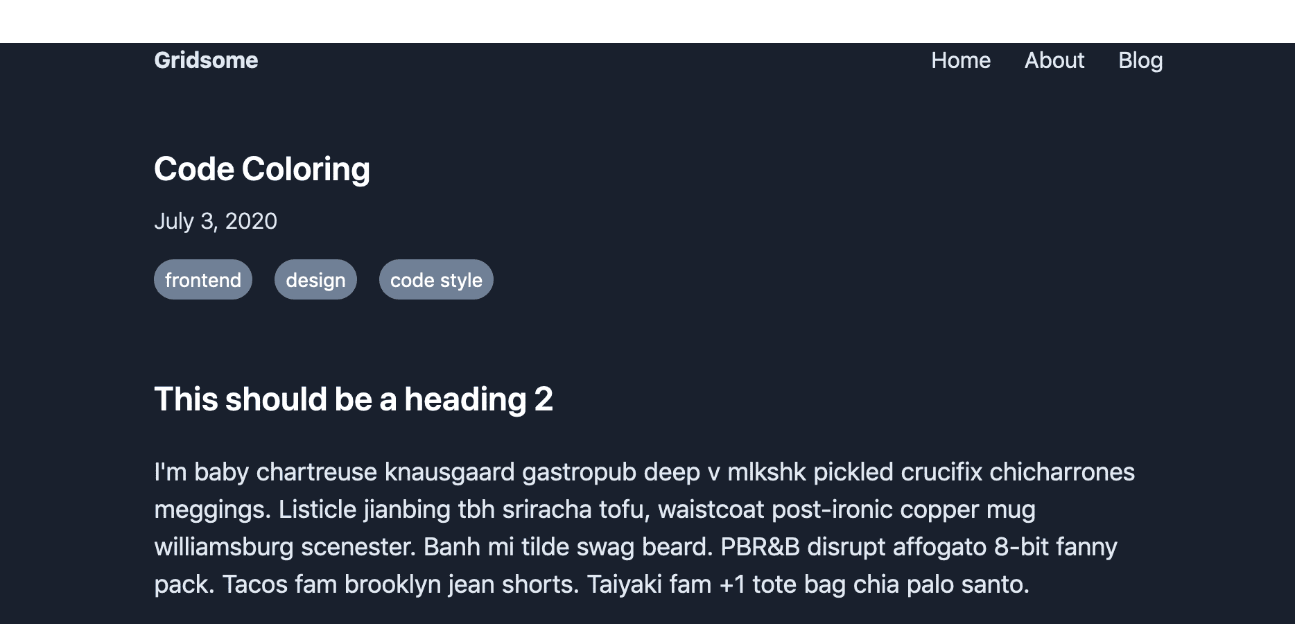
Okay. Now we should be able to add the dark-theme class to this wrapper, and the whole site is dark!
Oh! One more bug to fix. For the nav items to be fully included in our wrapper, we need to add flex flex-col to the wrapper’s classes.
Now dark mode looks good, too:
The user should be able to select their theme, so let’s add a theme switcher component to our nav bar.
Add a theme-switcher
At first we need to add some icons we can use.
The material icon set is open source, so let’s install their Vue bindings: yarn add vue-material-design-icons.
Now, create a file called src/components/ThemeSwitcher.vue with the following contents:
<template>
  <a
    href="#"
    class="text-default hover:text-gray-600"
    title="Toggle theme between light and dark"
    aria-label="Toggle theme between light and dark"
    @click.prevent="toggleTheme"
  >
    <Brightness4 v-if="theme === 'theme-light'" />
    <Brightness7 v-else />
  </a>
</template>

<script>
import Brightness4 from 'vue-material-design-icons/Brightness4'
import Brightness7 from 'vue-material-design-icons/Brightness7'

export default {
  components: {
    Brightness4,
    Brightness7
  },
  props: {
    theme: {
      type: String,
      required: true
    }
  },
  methods: {
    toggleTheme () {
      const newTheme = this.theme === 'theme-light' ? 'theme-dark' : 'theme-light'
      this.$emit('themeChanged', newTheme)
    }
  }
}
</script>
We add a simple a link that renders either the Brightness4 or the Brightness7 icon.
That a link calls the toggleTheme method when clicked, which changes the local theme variable and emits a themeChanged event.
Select the user's preferred theme and remember their settings
Finally, we'll integrate this component into our default layout:
<template>
  <div
    class="min-h-screen flex flex-col bg-default text-default transition-colors delay-100 ease-linear"
    :class="this.theme"
  >
    <div class="container max-w-screen-md mx-auto px-5">
      <header class="flex justify-between items-center mt-8 mb-12">
        <strong>
          <g-link to="/">{{ $static.metadata.siteName }}</g-link>
        </strong>
        <nav class="flex">
          <div>
            <theme-switcher
              :theme="theme"
              @themeChanged="updateTheme"
            />
          </div>
          <g-link
            class="ml-6"
            to="/"
          >
            Home
          </g-link>
          <g-link
            class="ml-6"
            to="/about/"
          >
            About
          </g-link>
          <g-link
            class="ml-6"
            to="/blog/"
          >
            Blog
          </g-link>
        </nav>
      </header>
      <slot />
    </div>
  </div>
</template>

<static-query>
query {
  metadata {
    siteName
  }
}
</static-query>

<script>
import ThemeSwitcher from '../components/ThemeSwitcher'

export default {
  components: {
    ThemeSwitcher
  },
  data () {
    return {
      theme: ''
    }
  },
  mounted () {
    const userPrefersDark = window.matchMedia && window.matchMedia('(prefers-color-scheme: dark)').matches
    const defaultTheme = userPrefersDark ? 'theme-dark' : ''
    this.updateTheme(localStorage.getItem('theme') || defaultTheme)
  },
  methods: {
    updateTheme (theme) {
      this.theme = theme
      localStorage.setItem('theme', theme)
    }
  }
}
</script>
The theme switcher component is now in our nav bar.
The layout component listens for theme changes, updates the theme locally, and even adds it to the localStorage.
We also load the user’s preferred theme via the window.matchMedia('(prefers-color-scheme: dark)').matches media query.
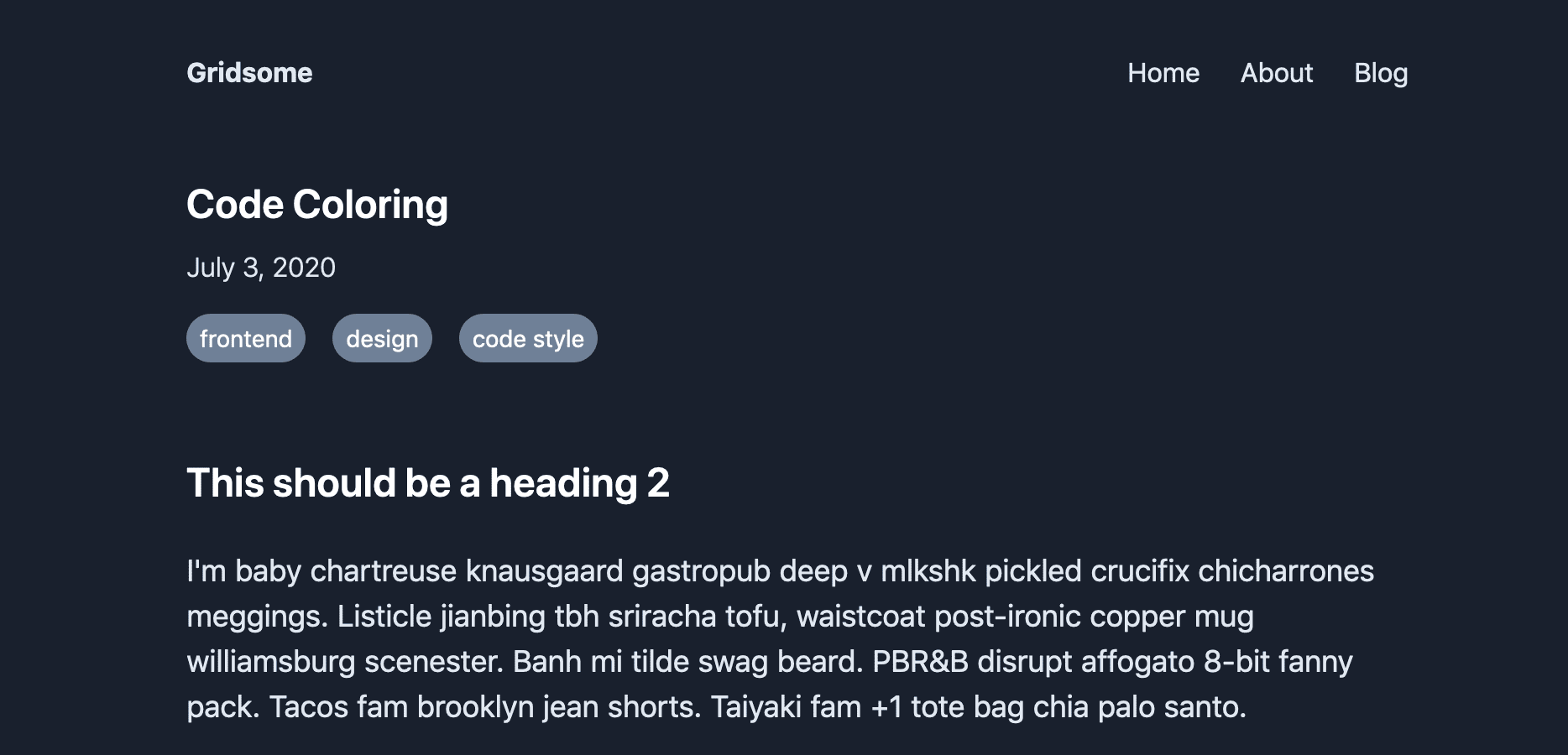
The icon is now beautifully visible in the navigation:
Next part: SEO guide for Gridsome
That’s it for this post on how to add dark mode support to our Gridsome blog with Tailwind CSS. In the next part of this series, we improve SEO for our blog.